
One Room Challenge Week 1: Mid-Century Eclectic Kitchen
I am thrilled to say it: I’m participating in the One Room Challenge just one short year after my husband, Andrew, vowed we would never do another one! This year, we raised the stakes, and decided to tackle the kitchen. That brings a whole host of complicated issues- contractors, moving appliances, and balancing style choices with practical choices since we use our kitchen all the time. (Call me style, my husband substance, and our dog, Effie, the reminder for practicality.)
If you’re new here, please know: I’m not a designer. I am not trained. What I am is an artist who likes to decorate, diy, and make a beautiful home for our family, and usually I have a pretty good eye for what I like. I’ve asked Teri (my internet friend and designer for my last ORC) a couple of questions along the way, because she would tell me if an idea was cool or not, and I’m thankful to have her just an instagram away. Also, my dad is very handy, and he has taught me how to be handy. (and sometimes, I have him help me when I’m not quite handy enough.)
Let’s talk about the before. I want to preface this by saying this: I realize that our kitchen isn’t heinous in these before photos, and that it (as most people put it when I told them we were renovating it) “looks fine”. It was fine! But there were some issues that would need to be addressed if we ever sold it, and I would rather enjoy the updated space now than update when (if) we’re leaving. Does that make sense? It does to me.

-Pain Point #1, and THE point behind this renovation: the floor. Looking at this just sends shivers up my spine. (I’m mostly kidding, but let me be clear.. we hate this floor.) It’s a floating, cork, snap-together plank floor that our house flipper found in a warehouse sale and installed incorrectly. Within two weeks of moving into our house in 2017, a piece of it (right under the three drawers) disappeared- maybe a victim of Effie? We don’t know. The transitions are poorly installed and it ripples when it gets wet, too. Finally, the deep burgundy/redwood stain is just not doing it for me, especially with the bright original hardwoods throughout the other rooms. I could go on, but I’ll spare you.
The floor changing to a large white hexagon with contrasting grout. I wanted to do something that felt clean and crisp, but also nodded to the era of the ranch-style home.

Here, the contrast between the original, beautiful floors and the floating cork is a little more clear. OOF. As my neighbor, who is also a house appraiser put it: “Yeah, I appraised that house a couple of times before y’all bought it, and every time I forgot how weird that flooring was.”
In this area, there isn’t much changing. We are going to replace this light- I got it when we moved, and even though I still love it, it’s just not right. The new one is still up in the air, but I’m hoping to have that chosen soon! The chairs are staying, and the table (which needs refinishing), is going to get quite the update. More on that in week 3! The shelves that I built and added are getting a small facelift, too. Still so glad I decided to join the open shelf crew.
Next, I’ll direct your attention to pain point #2, and its towards the right of this photo. And ironically, it involves “open shelves”.

That’s right, we have a floor to ceiling cabinet that lacks doors. When we bought this house, this feature was listed as open shelving (lol). Honestly, at first, I tried to make it work. but that is SO MUCH space to have open, and it’s deep, too. We figured out early last year that we had to have that space as real storage, and made it so. But man, it’s ugly. U-G-L-Y. It’s okay though, I have a plan.
I haven’t been able to locate the right-sized, matching doors, so my dad and I are going to build our own doors, and we’ll be making a tutorial just for you. Think caning, gold hinges, and something that totally separates that piece visually as if it’s a piece of furniture. (We hope. As of right now, that is going to be the key to hiding our clutter, and embracing a mismatched door situation.)
Below are two more views for ya. Other items we’ll be addressing:
-counters; this laminate is leaving the scene
-hardware; just a lil’ update to match our style
-cabinets; they’ll be getting a fresh coat of GREEN paint
-backsplash; where there is not one, there will be one.
-walls/trim; fresh paint. Can you guess the color?


Here’s a mood board for the project:

What do you think!? I can’t wait to get going and walk through it on my instagram stories. October will be busy, but at the end, we’ll have QUITE the kitchen. Check out all of the other guests here!
See ya next week!
A Gorgeous Wedding: Crests, Cards, and Live Paintings
Since Christmas, I’ve been hard at work on a wedding that I can finally share. And I’m here to share it all!! From a couture wedding crest to custom playing cards, to invitations and welcome box ~swag~, to a live reception painting, we did it big! This wedding was lovely in every way.

From the start, I knew this bride was classic and traditional: she loves fine papers and finishes, simplicity, and has a fun, but sophisticated style. She knows what she loves, and I love that! Since she lives out of town, her mother and I did most of the in-person legwork. (And, her mother happens to be my mentor and close friend, so that was fun!) The bride’s colors were a crisp blush and white, with touches of emerald green.
First, we worked on a custom wedding crest with two letters. I decided to do two versions: one in full color, and one in black and white. I knew they planned on having the invitations engraved, so a two-color version would streamline that process, but the full-color crest looked amazing on so many other things. After a few sketches, we ended up with this:
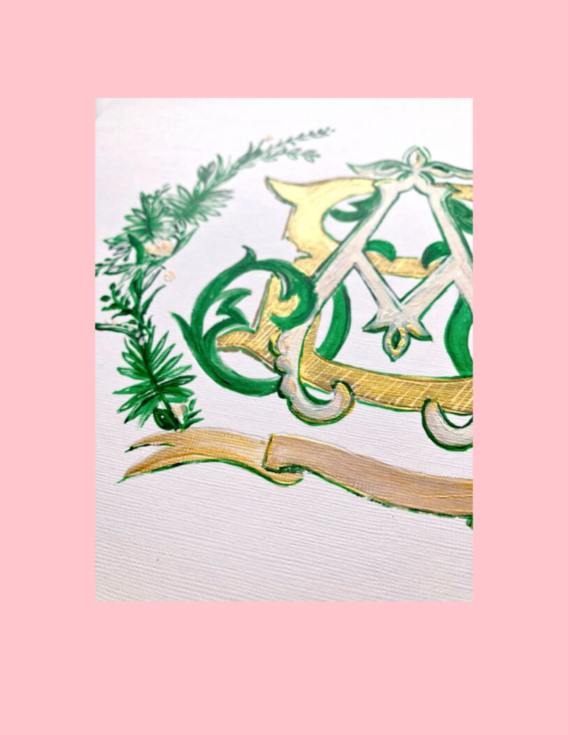
I still love it so much! After the crest was finished, ByFarr took over to create some incredible save the dates. The vellum overlay, large square format, and blush letterpress was stunning. A friend of the bride’s family did the invitation suites- simple, black and white, and hand written and engraved. They were stamped with a pearlescent wax seal, and wrapped in tissue paper.

Some friends of the family threw a welcome party after the rehearsal, and you guessed it— I did that invite, too! We opted to use a euro envelope with a handpainted lattice liner (you’ll see that lattice again soon!) and a cotton paper with emerald writing for the invite. At the top, we echoed the invitations and save the dates, and added the crest. This little canvas and easel made an appearance, and I think it is so cute.

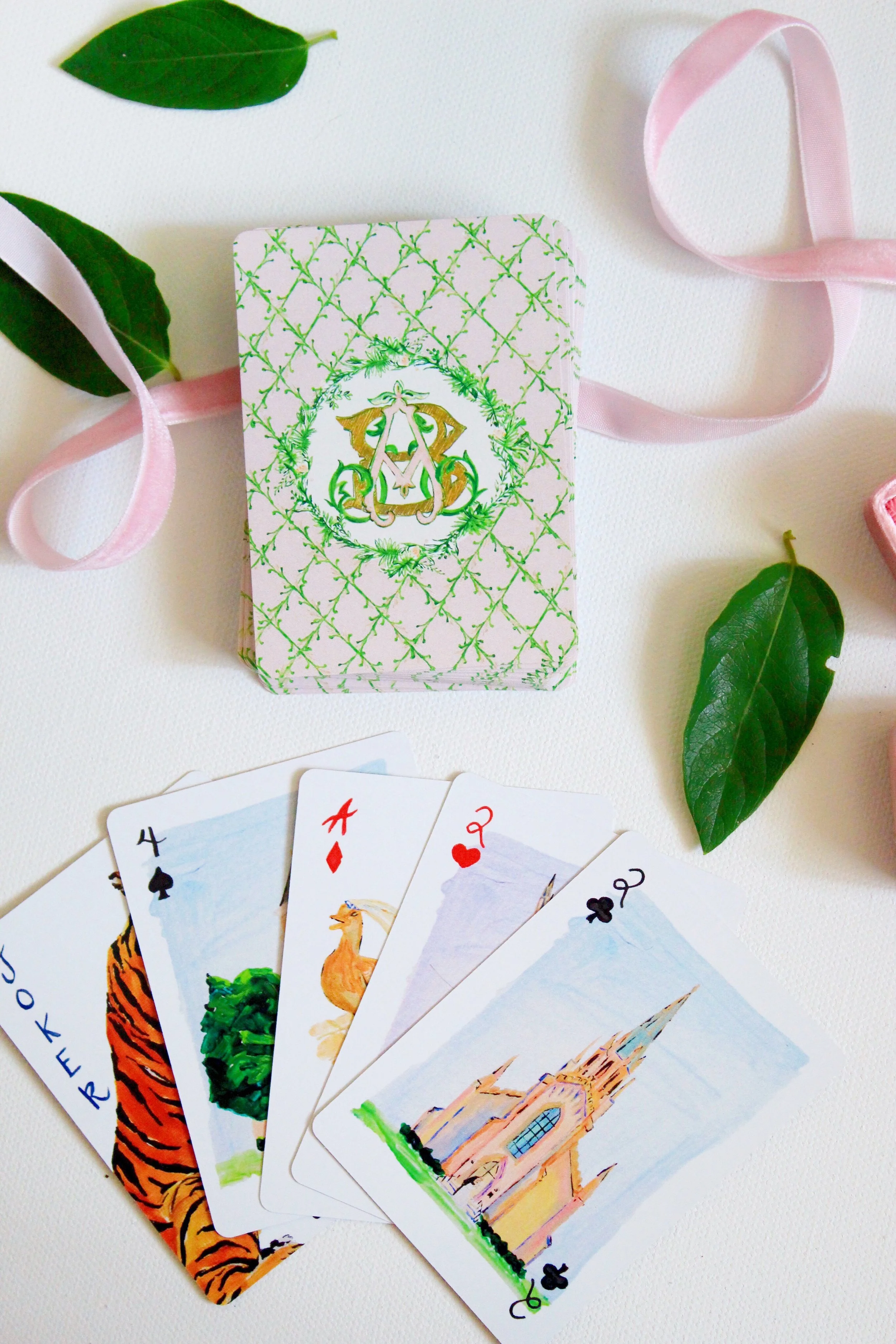
Next, we turned our attention to the welcome boxes… and I put together a custom deck of wedding cards! On the backs, I used a lattice in the colors of the wedding, included the crest, and then we chose four important locations for the couple for the suits. Those spots were: the First Presbyterian Church of Columbia (where the couple got married), the bronze duck statues of Boston (where the bride went to Tufts for dental school), Tillman Hall at Clemson (the bride and groom both graduated from Clemson and are big fans), and the Duke Chapel (the groom is head medical resident at Duke).
Can you spot the tiny bride and groom on the steps of the church?!
After the cards were finished, we started on the other welcome materials. There were labels for water bottles, little white baggies of hershey kisses with a small monogram sticker on the front, and beautiful tags for the top of the boxes. In addition, we made a map of Columbia with a welcome message, itinerary, and recommendations for the area:
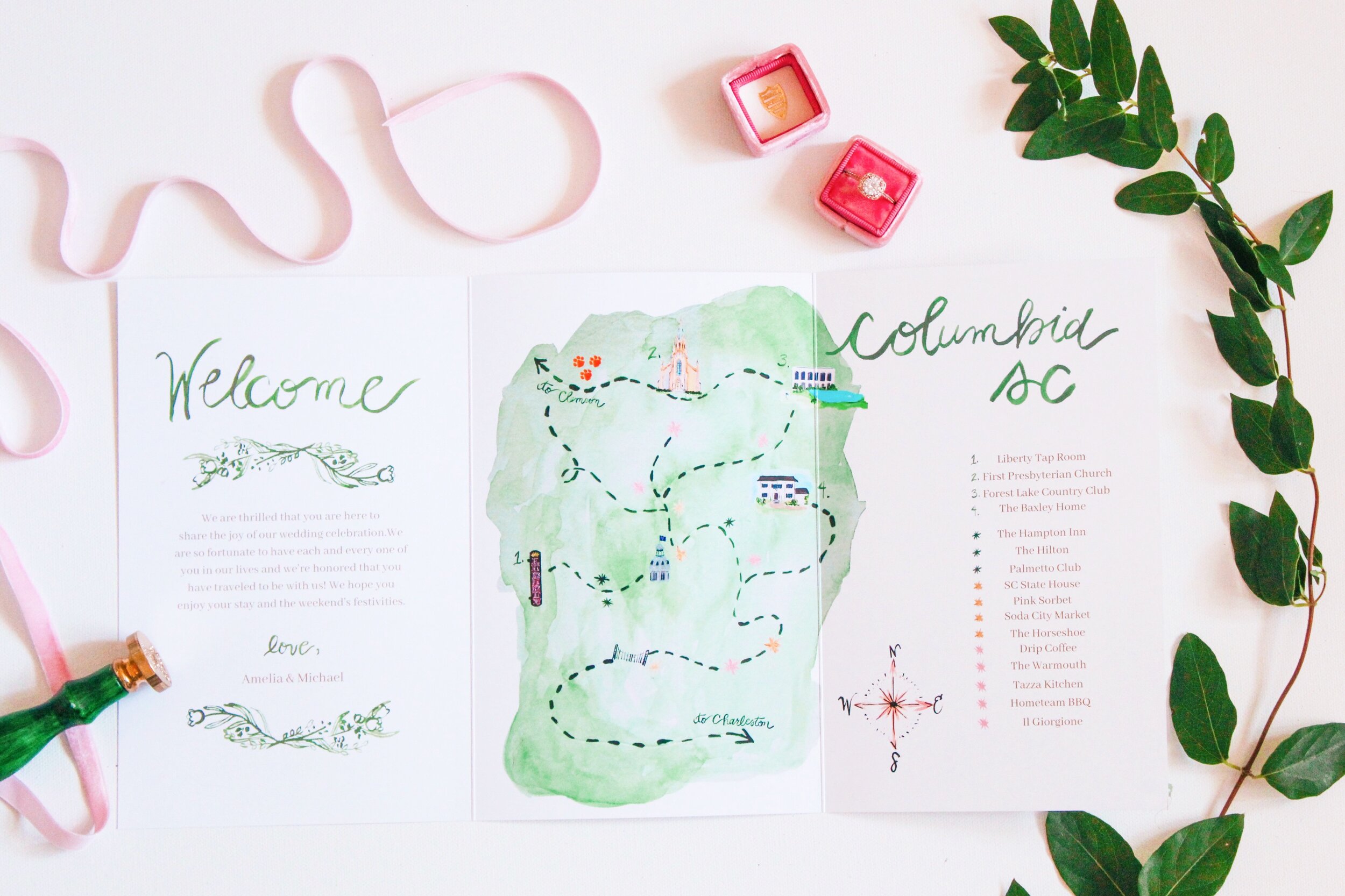
This map was my biggest challenge. I had never done anything like it! But after much trial and error, I was really pleased with how it turned out. The map was trifold, and included the same beautiful colors as the rest of the items from the wedding mood board. Pretzels and cracker jacks, plus a local magazine wrapped up the welcome box. I was reminded how much a love Cracker Jacks, too.
Finally, the wedding arrived!


If you’re an Earth, Wind, and Fire fan, you know that the 21st night of September is iconic. That was the wedding date- September 21st! Here I am with the background I’d been putting together all afternoon, and behind me are the stunning florals by Cricket Newman. Hydrangeas, Lilly of the Valley, garden roses, and gorgeous greenery were dripping from every surface. And that cake? It was DELICIOUS. I know I’m always interested in what food is served at weddings, so here is the menu: crab cakes and remoulade, mini tomato pie pastries, cocktail shrimp, fried okra, miniature tomato and cucumber finger sandwich rounds, and chicken tenders with all sorts of gourmet sauces. (And you know I love a sauce! I got to sample the okra and the shrimp and I can attest that they were great.) Then for “main” courses, they served shrimp and grits, beef tenderloin, and tacos. Toward the end of the night, a crepe station was set up- you could choose Nutella and fresh fruit or bananas foster! As a goodbye gift, people were given a warm chocolate chip cookie (in a branded baggie, of course) and a Clemson National Championship Coke. (Note: both families are HUGE Clemson fans. Personally, I’m a Gamecock. But I loved the small Clemson details around every corner!) Another sweet Clemson touch- the signature drink was a “Clemson Goodnight” punch. I’ll post the ingredients below.

For the painting, I was super excited to have permission to do almost anything. This bride decorates her home with a great mix of neutrals and bright colors, just like so many of my favorite people! I knew I wanted to highlight the florals and the couple doing their first dance, and I thought the pianist during the cocktail hour was a beautiful touch. The bride’s dress was custom and stunning, as were her classic up-do and simple drop earrings. The tiger had been at the welcome party the night before, so I added him into the painting, too! Very faintly, I added a 2-1 to the tiger’s jersey as a nod to the i-con-ic wedding date. Other notable details: the mother of the bride’s beautiful custom dress, Forest Lake Country Club’s new herringbone flooring, textured table linens, and my favorite part, the crystal chandelier.

Look for the final on Instagram soon!
This wedding brought back so many memories- the fun of planning a wedding, the stress of planning a wedding, and the satisfaction of seeing it all come together. I’ve learned so much in the last two years about art, stationery, design. I was thinking back to how in the dark I was when I put together my own save the date postcard in 2016, and honestly I’m shocked at how I managed that and how in love with it I still am! There is a huge pride that comes from working in-depth with the branding and art direction of a wedding, and having a hand in the little things that go a long way in making a wedding perfect. Plus, with a wedding this beautiful, I was honored to play such a big role! If you’re interested in one or all of these services, feel free to contact me.
From here, I’ve got one more wedding on the books for 2019, then we’re on to 2020! I can’t wait to see them all!
Quick Info:
Flowers \ Cricket Newman Designs \\ Venue \ Forest Lake Country Club \\ Church \ First Presbyterian Church, Columbia \\ Save the Dates \ ByFarr \\
Playing Cards, Crest, and Live Painting \ Megan Carn

Pick a Card, Any Card
I’ve never fully introduced the cards and all of the fun things you can do with them, so I thought I’d take a moment and devote a whole blog post! Plus, since Labor Day is almost upon us, it’s also the perfect time for a little shameless promotion! Did I say that? Yes.
The Origin Story
I decided to make these cards after researching products for the Suthin Girl Summer Box and thinking, “what would be a unique product that I could make that isn’t all over the place? What would be the perfect little gift?” That’s a tough couple of questions. It had to be small enough that I could store a large quantity easily, and the price had to be low enough for me to buy at a “I’m storing these in my office” quantity. Lots of quantity thoughts.
After a ton of painting and thinking and sourcing, I finally had the Safari Deck. I’m obsessed with these cards. They have a little whimsy, but still maintain the parameters of the standard poker deck: classic red and black hand-painted pips, a standard 54 cards, and standard poker deck measurements. They come in a sassy clear acrylic case, and the printing is vibrant and lovely.

When I first posted the cards, I had no clue what kind of response I would get. In-person, the few people I told were a mixed bag. Some were EXCITED, in all capitals, but some were much cooler towards the idea. (Why would I pay $21 for playing cards? Why are you doing playing cards? Isn’t that a little grandma-ish? were a few of the comments I heard.) So you can imagine that when I sold out twice I was thrilled! They were received so well, and I immediately started thinking on expanding them.
Dog Decks
With this deck, I decided to riff on the classic card deck a little more (vs. going in a totally original direction). I have a HUGE archive of dog paintings that I’ve done in the last five years that I am in love with, and I wanted to take advantage of those pieces and their absolute cuteness, too. So we sat down and chose some fan favorites: Snoop the Dachshund, Ranger the Golden Retriever, Briar the Black Lab, and the sweetest bulldog on earth. Then, we looked at the other cards: I wanted a Cavalier King Charles for the King card, a Corgi for the Queen, and then we went for Captain the Goldendoodle and this smiling poodle for our Jack and Ace. I opted for navy and hot pink pips to match the paintings in the cards and the fun vibe, and used my signature font for the numbers. Finally, we used the standard measurements and 54-card decks, as we did with the Safari cards, and used a classic layout for the dog faces (as they would appear on a standard deck.) These also come in acrylic cases, and I think they are just perfect for the game drawer!

Let’s Play
Here’s a list of 5 card games to keep handy while you’re at the beach:
1: Go Fish! My childhood favorite. Add a new 21 and over twist by drinking anytime someone doesn’t have the card you asked for. (Please drink responsibly!)
2: War. Another favorite of my younger years. I used to play this one with my grandma all the time!
3: Blackjack; We all know about blackjack, but it is so fun to play in a group!
4: Poker: I’ve never mastered poker, but I think it’s a classic everyone should know. Don’t bet too much until you’ve learned it!
5: Solitaire; The game I will forever go to and love. AND you can play it by yourself!
Luckily, my card decks are perfect for all of these games and any card game you can play with a 54-card deck. Get one before Labor Day as a hostess gift or to pack in your bag!

Bippity, Boppity: To-Do List
Whew. Summer has flown.
Today I’m channeling a favorite online friend (and the lady who organized my studio), Kate Waldo. Every Sunday or Monday, she talks about prioritizing the harder (larger, more detailed) tasks for the beginning of the week, and saving the easier, breezier tasks for later. I’ve been trying my best to take this idea to heart, even though some weeks it feels like EVERY task is a big ticket item. What can I say? I’m dramatic sometimes. More than loving a little drama, I love making lists. It’s the only way I feel like I can get organized. Any time something pops into my head, I try to get it onto my list or calendar so that I don’t forget. (Because I absolutely will forget it if I don’t!)
I put this list-making masterpiece together just for fun as so many are heading into the new school year, new jobs, or maybe just want that mid-year clean slate feeling that you get at the new year. There’s just nothing like a shiny new something with all good intentions for productivity and organization.
I hope you enjoy it! Everyone loves organization, and when it’s rainbow?! Forget about it.
Here’s to keeping the rest of 2019 and the start of 2020 all together!


Here’s a little preview of the list!
Tag me on instagram when you print it out… I can’t wait to see your lists on desks, fridges, and in planners all over! Here are a couple of ways I would use it. (Not that you need the help. You’re in control here.)
On a clipboard: Are you on the go? Lets clipboard that sucker. Print multiples so they’re ready for you when you have a need to get organized!
In your planner: turn it sideways and print two per page. It’s the perfect size for your Erin Condren organizer! Keep them in that pocket divider to whip out when things get dicey. They’ll be there to support you!
Laminate it: You may not know this, but I’m a girl who loves to laminate. Laminate your list, put it on your fridge, and then use a dry erase marker to keep your house in order. Then, windex it and you’re ready with a clean slate. Want to be extra? Organize in rainbow markers. That’s what I’m planning on doing.

Hey, what do you want for supper?
What are you thinking for dinner?
What are we going to have for supper tonight?
Do we have the stuff to make _________?
… All ~haunting~ questions that I get and ask often! Pretty much every day. I feel like meal planning isn’t even a healthy thing at this point, it’s more of a thing to try and have a plan so we’re not staring at the fridge wondering what the heck we’re going to make. A personal chef would be another option, but that’s not in the budget. So I made a quick little meal plan helper! One less thing to think about every day is a win in my book.
I’m planning on laminating this and leaving it on the fridge. That way, we can write on it with a dry erase marker and it’s all there!

get the planner!
I’m also going to take this opportunity to share two cool things:
#1 is Instacart. I haven’t been truly grocery shopping in two years and I have zero regrets. It is unbelievably easy and I can see what I have in my kitchen as I order! It really makes my life better, and you should download it. (Unless you love trudging through the grocery store trying to remember how many eggs you have at the house. In that case, keep doing what you’re doing.) Click here to sign up! You’ll get $10 off your first order and I’ll also get $10, so it’s a win all around.
#2 is HelloFresh. Now, I’ll say it: I’m not 100% sold yet, but we’re still figuring it all out. Some of the meals have been incredible, and others have been a little “meh”. Also, it frustrates me that the best-looking ones are “gourmet” upgrades- that gets expensive really fast! On the plus side, they are fairly healthy and so dang easy, so it really solves a problem! (in the past we’ve done BlueApron, and we enjoyed that too.) If you want a promo code for HelloFresh to try it out, comment your email below! I’ll send you an invite and you’ll get a free week. Lucky you!
Okay, that’s it. Let’s get to summering without any questions about what we’re eating! We have a plan!